
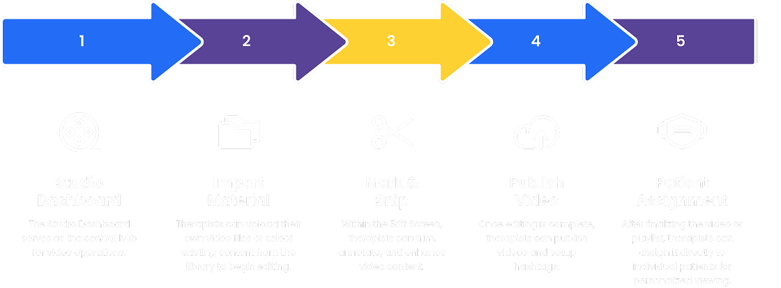
Mark, Snip, and Succeed
Make training and learning like TikTok
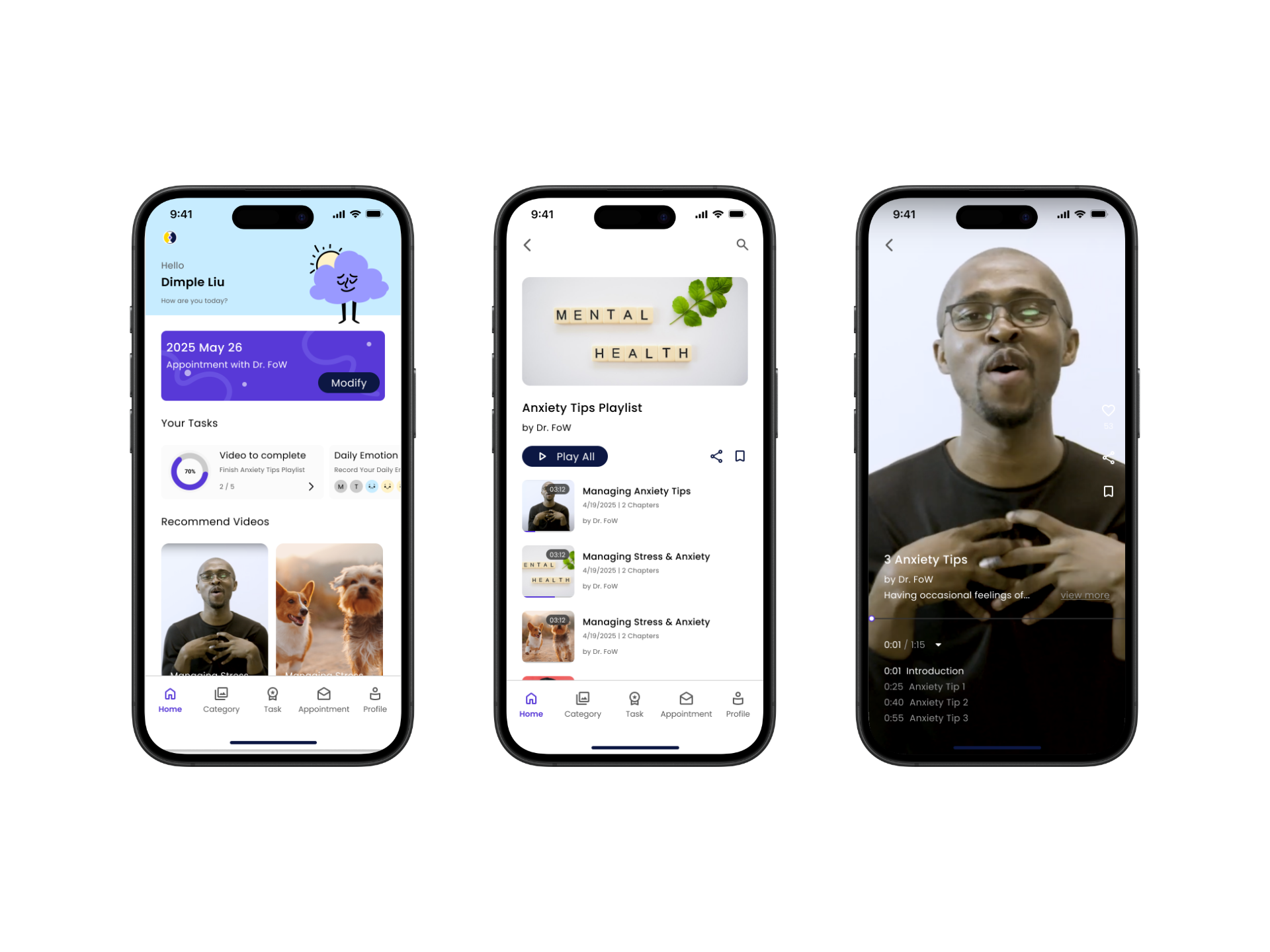
The Guide App is a Learning Management platform designed to redefine employee training through byte-sized stories. With features that increase engagement, reduce onboarding time, and scale training efforts, Guide has become a go-to solution for businesses aiming to enhance their training processes.
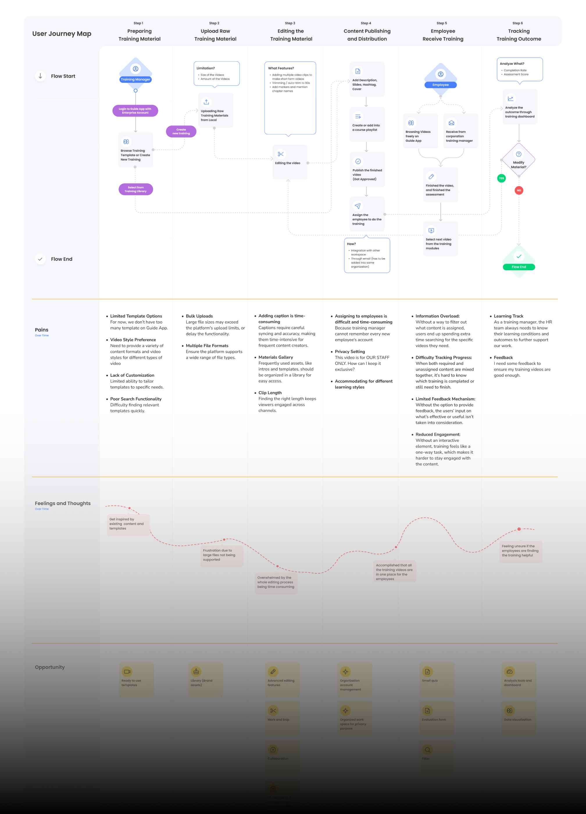
Guide faces challenges in supporting users who need to efficiently manage and interact with long-form content. Addressing this gap is vital to improving the user experience and boosting productivity.
The core opportunity lies in significantly improving the user experience for both content creators and learners within the Guide App.
UIUX Designer & Developer
Figma, Adobe Illustrator, Figjam
6 People Capstone Project
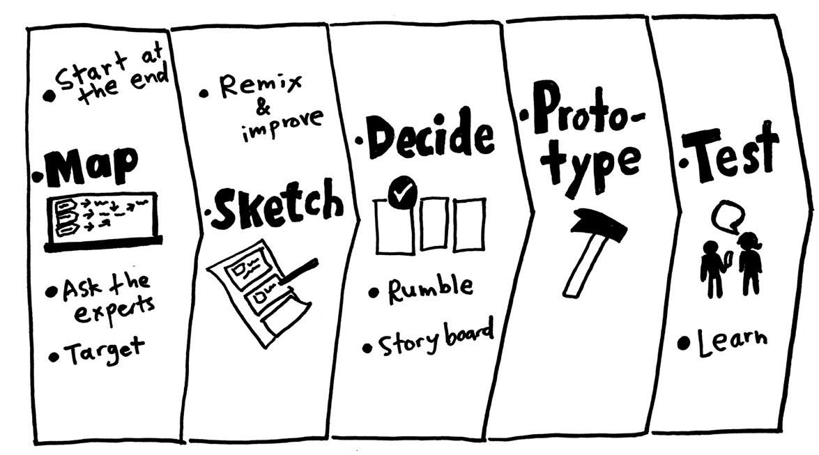
The Design Sprint methodology guided our development of the functionality.
This proven framework enabled us to rapidly address user challenges, generate innovative solutions, and validate them through rigorous user-centric testing.
Through the following research, we found that a significant factor contributing to long editing times is the lack of integrated video editing tools within the Guide App. Due to the platform's video length restrictions, users often need to utilize external editing software to adjust their videos before uploading, adding an extra step to the content creation process.
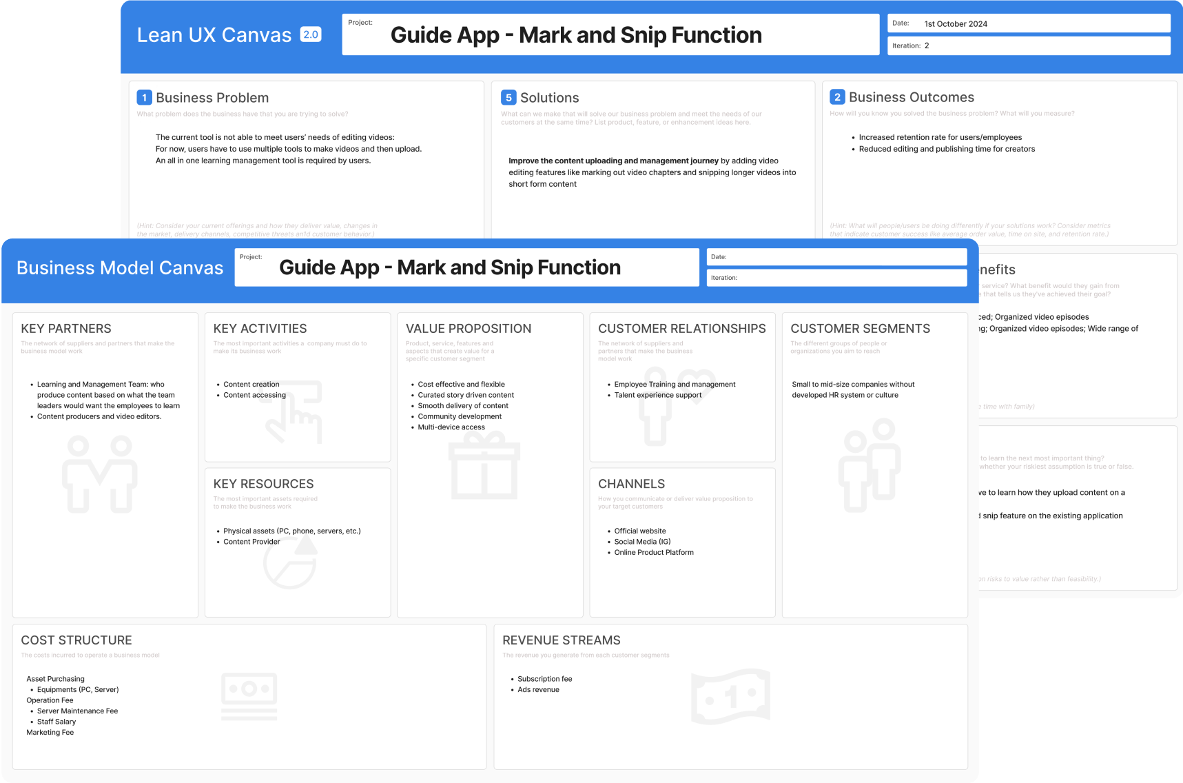
We employed the Lean UX and Business Model Canvas methodologies to ensure our research findings and design solutions aligned with the business goals.
These frameworks helped us continuously validate that our proposed solutions not only addressed the identified user needs but also contributed to the overall business objectives. We can also explore potential revenue streams, identify key partnerships, and assess the overall viability of the feature.
Interviewees expressed strong interest in and positive feedback towards micro-learning formats
Interviewees find finding right videos for editing is the most time-consuming part
Interviewees desire to track the training performance more easily and have timely feedback
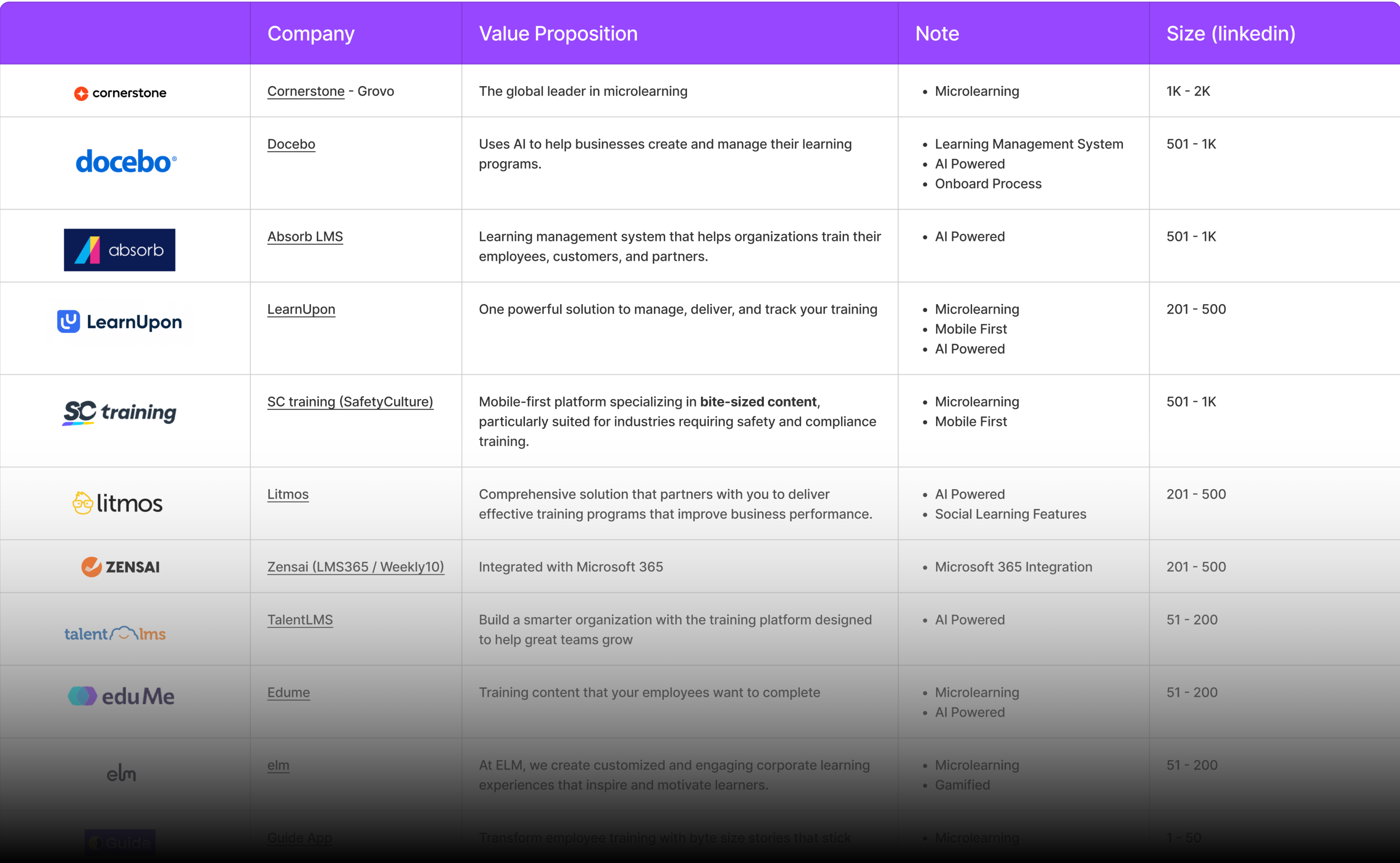
Competitive analysis revealed key trends in modern Learning Management Systems, a strong emphasis on mobile-first design, the rise of short-form video content, seamless integrations with workplace tools.
Furthermore, advanced video editing capabilities, including AI-powered enhancements, and flexible sharing options, are increasingly crucial for engaging learners and streamlining the content creation process.
Through collaborative ideation sessions, including 'Crazy 8' and 'How Might We' exercises, I contributed to the generation of a diverse range of design concepts.
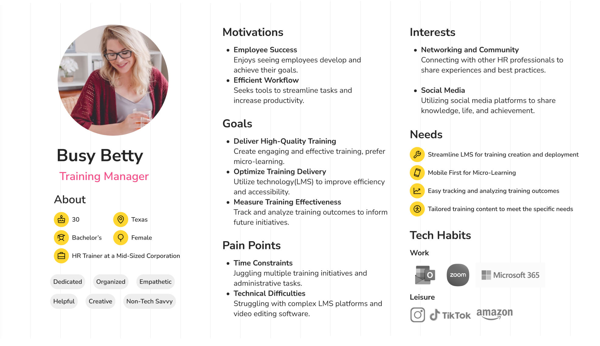
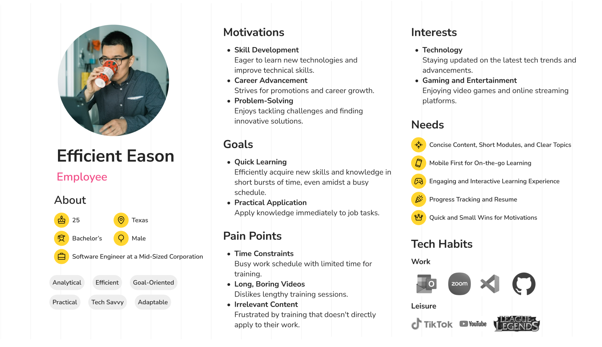
By creating user personas and mapping user journeys, we gained valuable insights into how users interact with the product and identified key pain points and opportunities for improvement.
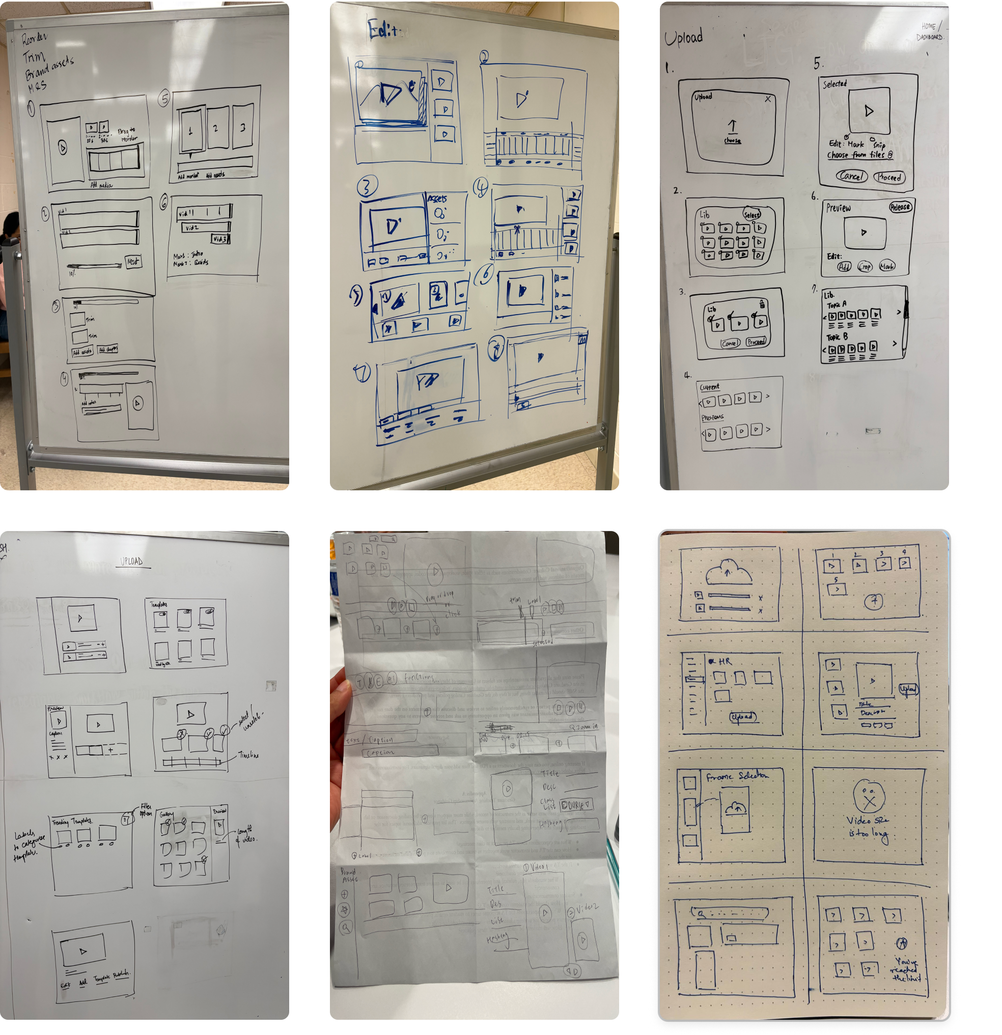
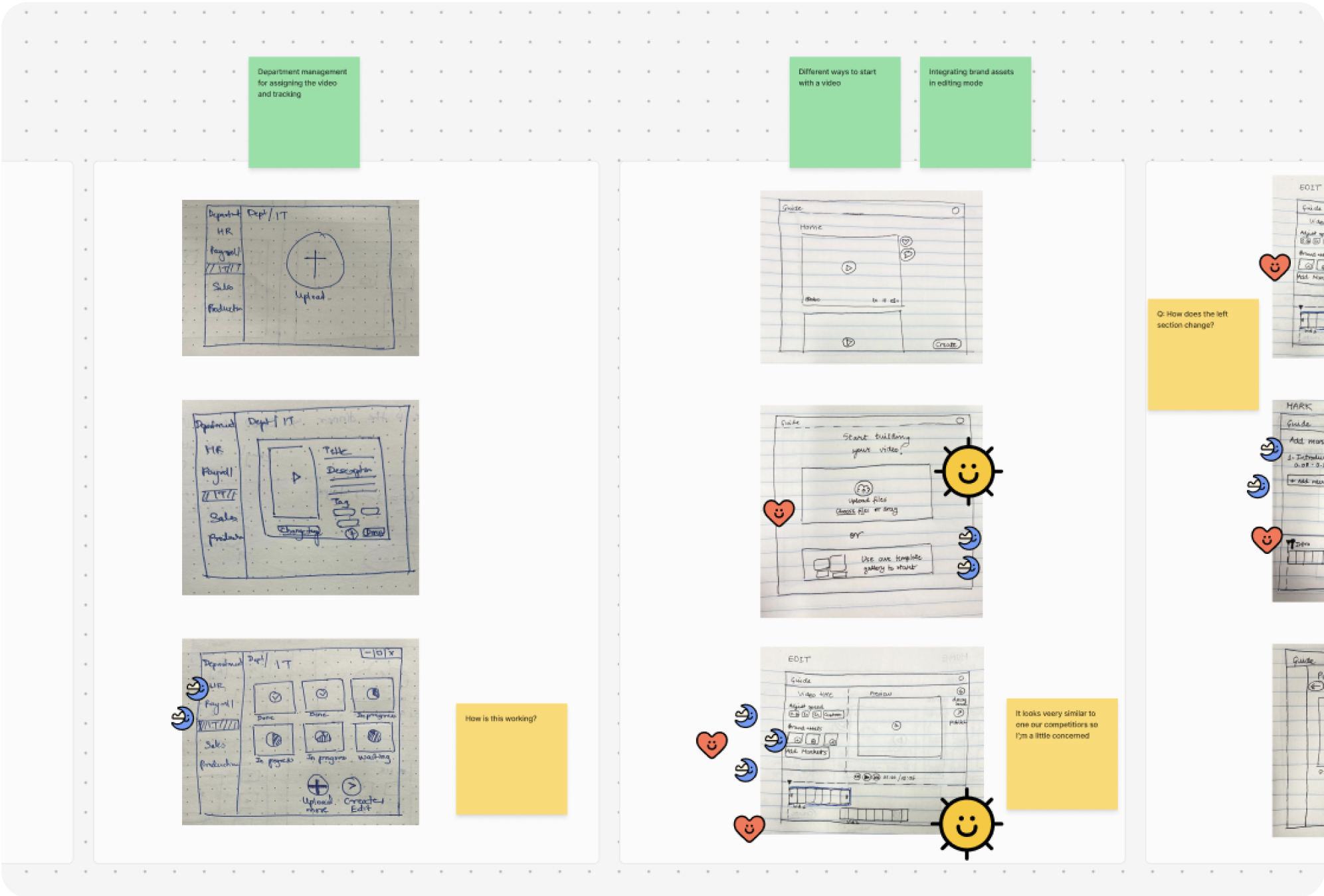
During the ideation phase, we engaged in a dynamic process of sketching and brainstorming to explore a wide range of innovative design concepts and potential solutions.
We actively participated in collaborative sketching sessions where we explored a variety of ideas to generate a diverse pool of potential solutions.
Each team member also conducted independent sketching exercises to further refine their individual ideas and explore unique perspectives.
To ensure we selected the most promising solution, we conducted a rigorous evaluation and refinement process.
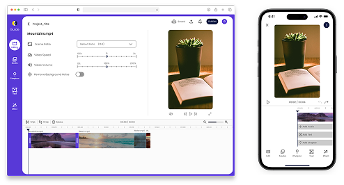
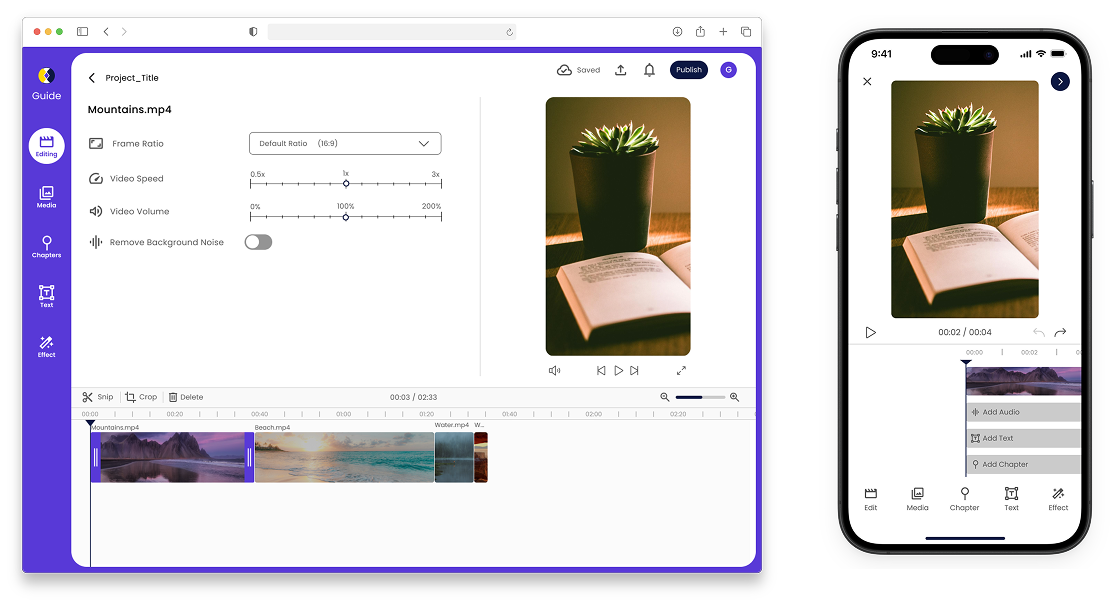
As the UI Designer, I led the development of a functional prototype that incorporated the key features of the 'Mark & Snip' tool.
This prototype enabled users to easily mark and tag key sections within long-form content, effortlessly create and save contextually-rich snippets from the marked sections, and interact with the tool through intuitive and user-friendly controls and visual markers, all designed to enhance the overall usability and accessibility.
Difficulty in prototyping complex interactions, such as drag and drop, and resizing function
Different view of same screen before and after editing stage is hard to be consistent through out the prototype
The final phase involved rigorous user testing to gather insights into usability and functionality. We utilized Useberry platform, I conducted usability tests with a diverse group of participants.
We designed 6 scenarios to evaluate user interactions, carefully timing their performance and conducting follow-up interviews to understand their thoughts and feelings throughout each task. Based on the valuable feedback gathered during these tests, we then iterated on the prototype design, refining the interface and functionality to address any usability issues and ensure the final product effectively met the needs and expectations of our target users.
Users expect the editing features to be placed at the top of the side menu and the settings features at the bottom, as editing is used more frequently.
The fade in animation is expected to be located under the 'Effect' icon but the button is unclickable.
It is confusing to relate the “markers” to “chapters” (Editor-facing vs. Viewer-facing)
Keep current navigation design, but change the sequence of the features. We plan to do further testing on users.
Add some explanation or examples about “Mark” to explain what is this feature and how it works. For example, adding Coach Marks when user first logs in, explaining what each feature means.
Add visual cues, such as labels, to indicate that uploaded videos appear in the timeline.
This is an ongoing project, we are still working on improvement and further research and usability test.
This project provided invaluable experience in the full UX design process, from user research to prototyping and testing. The Design Sprint methodology proved to be an effective way to rapidly develop and validate our design solutions. Developing the "Mark & Snip" tool was particularly rewarding, as it directly addressed a significant user pain point. One of the key challenges was balancing the desire for advanced features with the need for a simple and intuitive user interface.
In future steps, I would dedicate more time to user testing, allowing for more iterative improvements based on user feedback. I would also explore more robust prototyping tools to better simulate complex interactions.
This project highlighted the value of collaboration and communication within a design team and also with the client. I learned how to effectively translate user needs into tangible design solutions and how to advocate for the user throughout the development process.
Adapting to the change in focus was initially difficult. We need further research to understand the new target audience and ensure our work aligns with their needs.
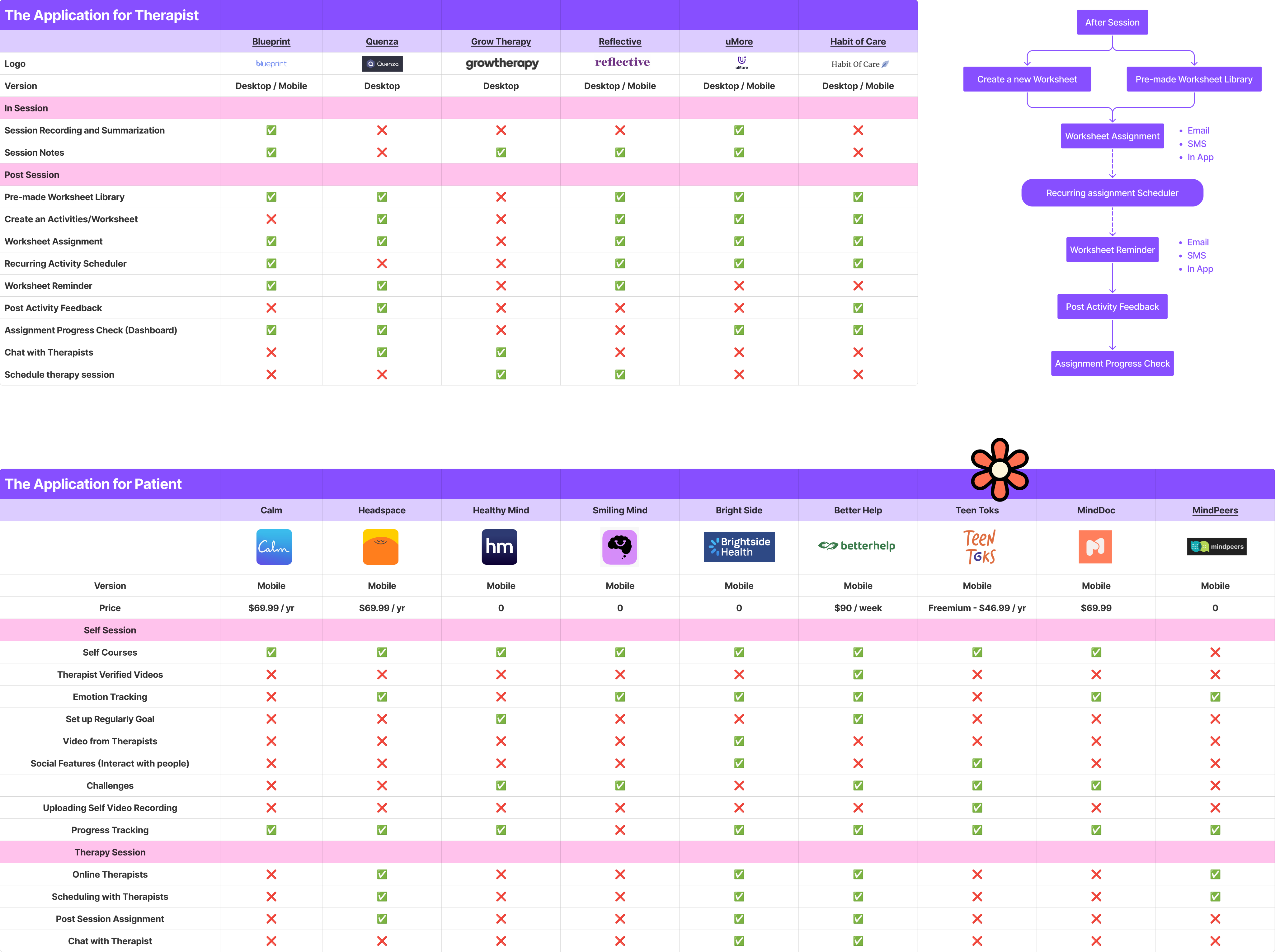
To validate the niche market potential and differentiate Guide, we conducted a comprehensive market analysis of existing mental healthcare applications.
Conducted Competitive analysis of different apps and websites in the market with the similar purpose, including features and business model analysis.
Conducted a thematic analysis of forum discussions to identify the patterns in therapists' experiences on Post Session.
We want to analyze video-editor embed platform's investment in in-app editing to understand why platforms build native tools despite existing alternatives.
I spearheaded the competitive analysis of mental health applications, identifying two distinct categories: therapist-facing and patient/user-facing. My analysis included a comprehensive review of the therapist-side application workflows, examining each feature in detail.
We found a distinct niche emerges in therapist-focused platforms by expanding multimedia capabilities. While patient-focused apps often leverage videos, articles, and guided meditations, therapist-centric tools typically lack this engaging content. Integrating diverse multimedia within therapist-focused platforms could significantly improve patient engagement and adherence, creating a competitive advantage.
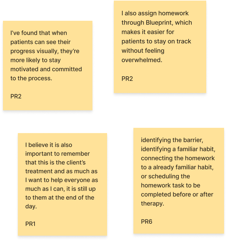
Some therapists use structured platforms like Blueprint for progress tracking, while others focus on collaborative problem-solving and adapting to the client's pace.
For sustained motivation, patients require platforms that offer visual progress tracking to increase the motivation and some tools or tips can also help them keep on track.
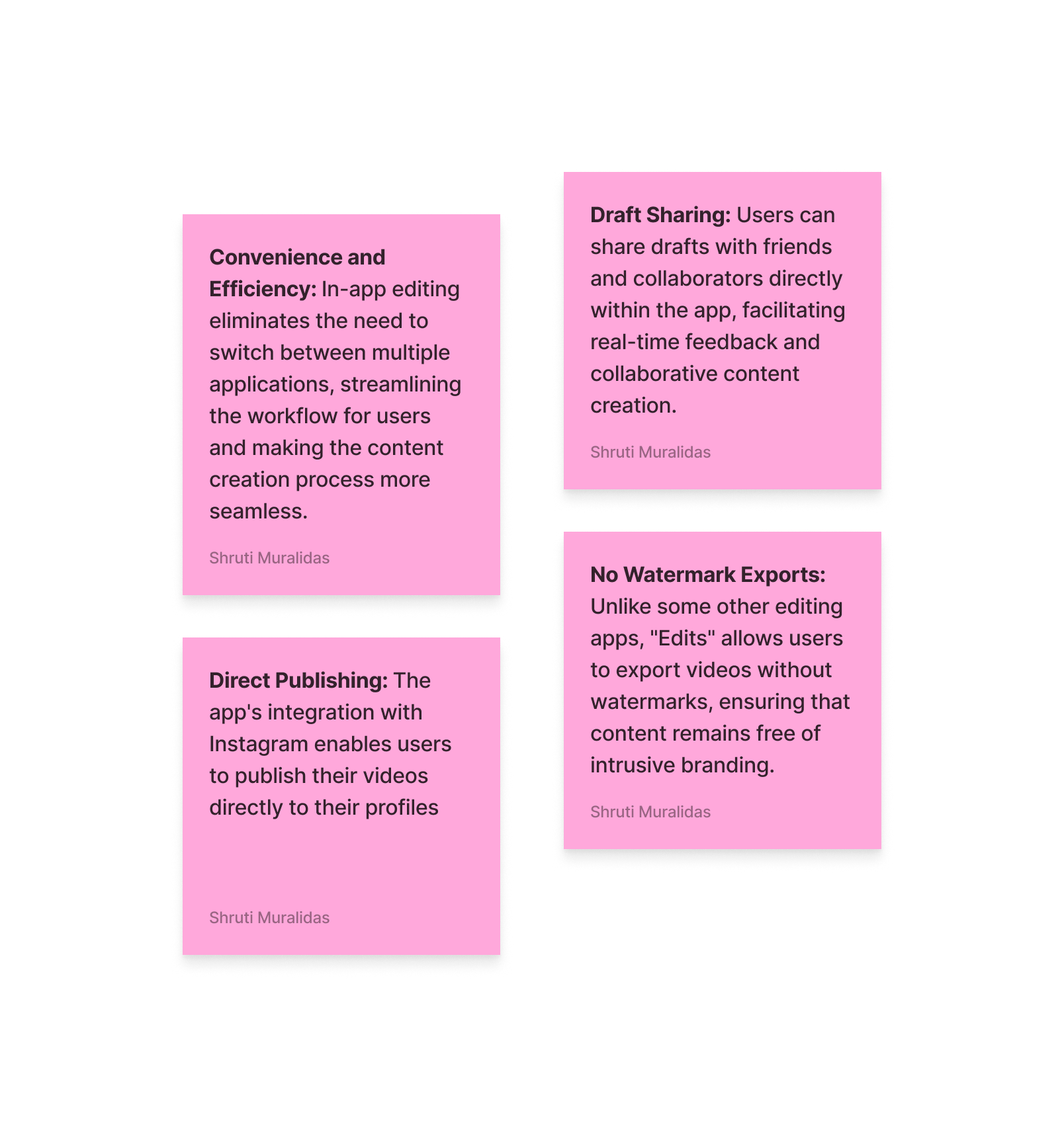
We analyzed Instagram’s investment in in-app editing to understand why platforms build native tools despite existing alternatives. We found that seamless workflows, faster publishing, collaboration ease, and content polish were core benefits—validating our decision to build a lightweight editor within Guide.
Our research identifies a significant opportunity for the Guide App to establish a unique niche within the therapist-focused mental health application market.
While existing therapist-centric platforms predominantly rely on traditional post-session worksheets, Guide App can differentiate itself by integrating diverse and engaging multimedia content, such as videos, articles, and guided meditations.
Furthermore, Guide App can leverage its development by focusing on a user interface that balances simplicity with efficient access to advanced features, allowing them to capture a larger market share. By focusing on enriched multimedia content and a superior user experience, Guide App can create a competitive advantage, positioning itself as a leading platform for therapists seeking to enhance post-therapy patient support.
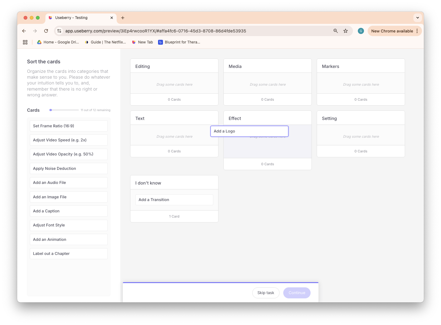
After the first usability test, we found that many people have concern and different thought on the navigation categories, so we decided to conduct a further research on the navigation. We used card sorting to let people categorize the features.
Following the card sorting test results, we decided to remove the "Settings" and "Brand Assets" categories. Because the features within these categories could be integrated into existing ones, reducing cognitive load for users.
We also refined the category names for clarity. For instance, we renamed "Caption" to the more direct "Text."
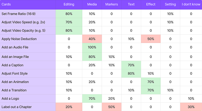
Users found the "Label Chapter" feature difficult to categorize. During our testing, 20% placed it under "Editing," 30% expressed confusion, and 50% categorized it within "Markers."
Based on the insights gained from the card sorting activity, we refined our navigation structure. Subsequently, we began developing the mobile low-fi Wireframing and iterated on our desktop high-fidelity design.
Based on competitive analysis, usability testing, and user flows, we organized key features into a clear information architecture to address user requirements.
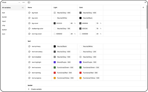
We implemented the spacing guidelines and icons from the client’s design system.
To ensure consistency across our team's work on the wireframes, we established a basic component library and design tokens.
We tried to align design interactions across devices for consistency for reducing learning curve across platform.
Implementing platform-specific interactions to accommodate the unique behaviors of each device.
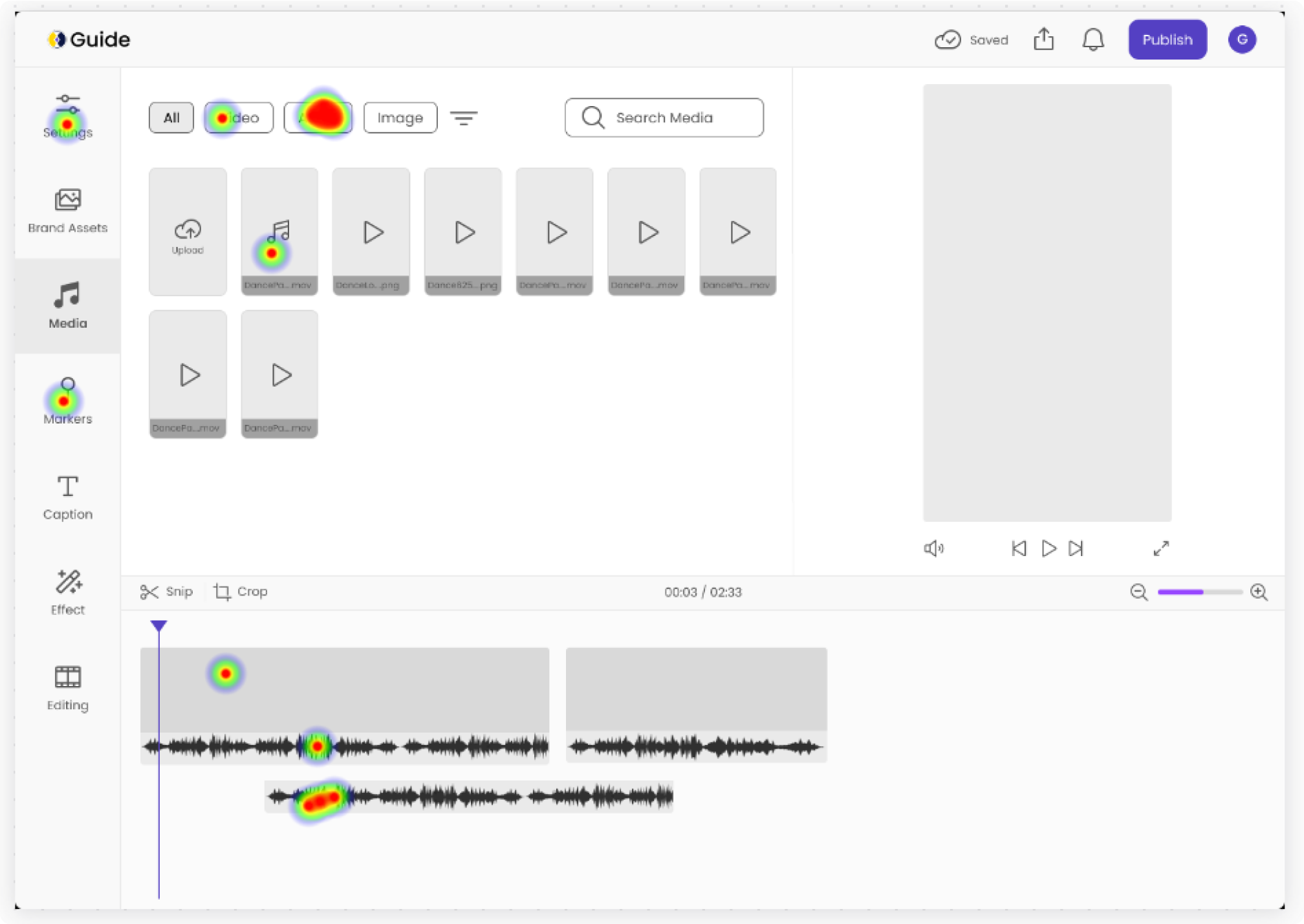
We conducted scenario-based usability testing on our mobile prototypes using Useberry. Following each scenario, we asked probing questions to gather deeper insights. The scenarios were designed to simulate a complete workflow, encompassing video upload, trimming, adding text and audio, publishing, playlist inclusion, and assignment to patients.
3 out of 5 users were confused about the purpose and behavior of chapters. Suggesting guidance on how chapters relate to video structure.
Some users were confused about how to create a new tag, not realizing it could be done directly by typing into the search bar.
Users indicated that the upload video icon is not extremely intuitive and should be clearer.
To assist first-time users who may lack video editing experience, we've implemented a coach mark upon their initial entry into the editing tools.
To make the create function clearer, we've updated the search button's wording to include "Create new tags."
To enhance accessibility, we've added descriptive "Upload" text adjacent to the upload button.