[ Case study (01) ] — Lead UI/UX design · Poker companion app · In user acceptance testing
Water
I lead design for Water, a poker companion app people use one-handed, at the table, in low light. I redesigned the experience around one layout language — and changed how our team designs: the design system and every iteration moved from Figma into code with Claude Code, producing clickable prototypes and a Design Hub where the frontend developer and PM track work and answer questions.
- Problem
- In an app people use one-handed, mid-game, the main actions got lost, every page looked alike and the AI coach was hidden. Hand-off from Figma couldn’t keep up with the code.
- My role
- Lead designer, directing a graphic designer and working with a PM and a frontend developer.
- What I did
- Set one layout language (Hero + Sheet), moved the design system and iteration from Figma into code with Claude Code, and built a clickable prototype of the whole app plus a Design Hub for the PM and developer.
- Result
- A review note now reaches the prototype in 1–2 days instead of 2–3 weeks. Now in user acceptance testing, with 41 prototype versions, 76 PM questions and 10 function specs live in one hub instead of chat threads.
Project overview
Water helps poker players record hands, take notes on opponents, follow tournament series, track their bankroll and ask an AI coach about a spot. Players often open it mid-game: one hand on the phone, the room dim, a decision coming. That picture came from quick interviews with players in our Discord community.
The old interface gave every feature the same dark card at the same size. As lead designer, with a graphic designer working under me, I owned the redesign end to end — the UX direction, the layout language, the design system, the prototype the team builds from — and the workflow that gets design to the developer and PM.
Problem & goals
Main actions get lost
Recording a hand and taking table notes are the most frequent tasks, but they were the same size as everything else and moved around.
Every page looks alike
Home, events and hands were all lists of dark cards. You had to read the title to know where you were.
The AI coach is hidden
The feature that sets the app apart lived in a single input in the header, with no clear entry on the homepage.
The goals
One tap. One glance. One question away.
Frequent actions in one tap, in thumb reach · every page recognisable at a glance · the AI coach visible and used.
Where Figma stopped keeping up
We started the usual way: I built the design system and wireframes in Figma. But with AI speeding up how code gets written, the design file became the slowest step in the loop — and the hardest one to hand over.
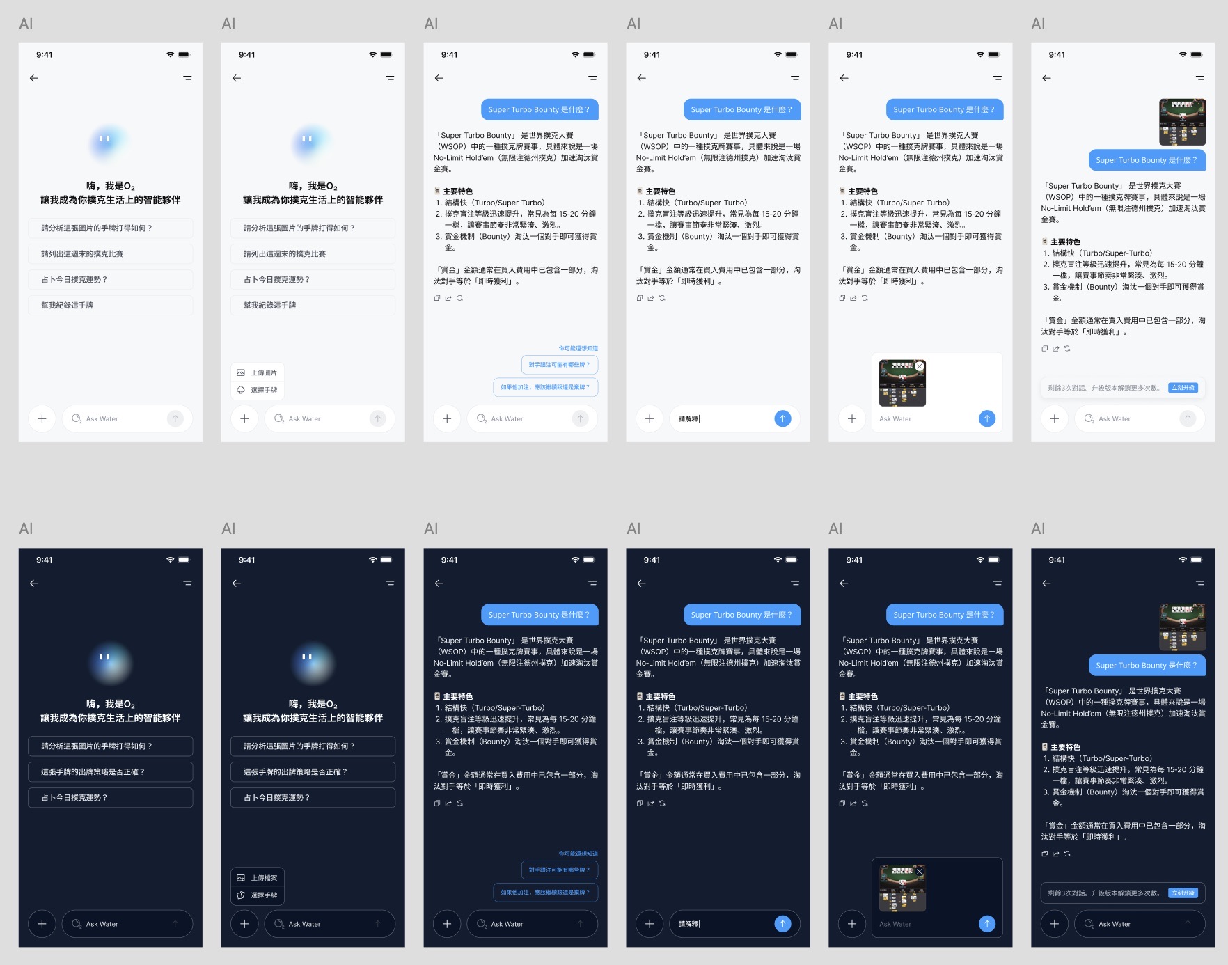
Hand-off lost detail
Static frames had to be re-read and rebuilt in code. Spacing, states and motion were interpreted, not shared.
Iteration was slow
Every review note meant redrawing frames, re-linking a prototype and exporting again. A change took 2–3 weeks to reach something the team could try.
Hard to try for real
The PM and developer reviewed pictures of the flow, not the flow — so feedback came late, often after it was built.
Moving the design system into code
So I moved the design system and our iteration into Claude Code. The system now lives as a page the frontend developer copies from: tokens and components written in the same stack the app uses.
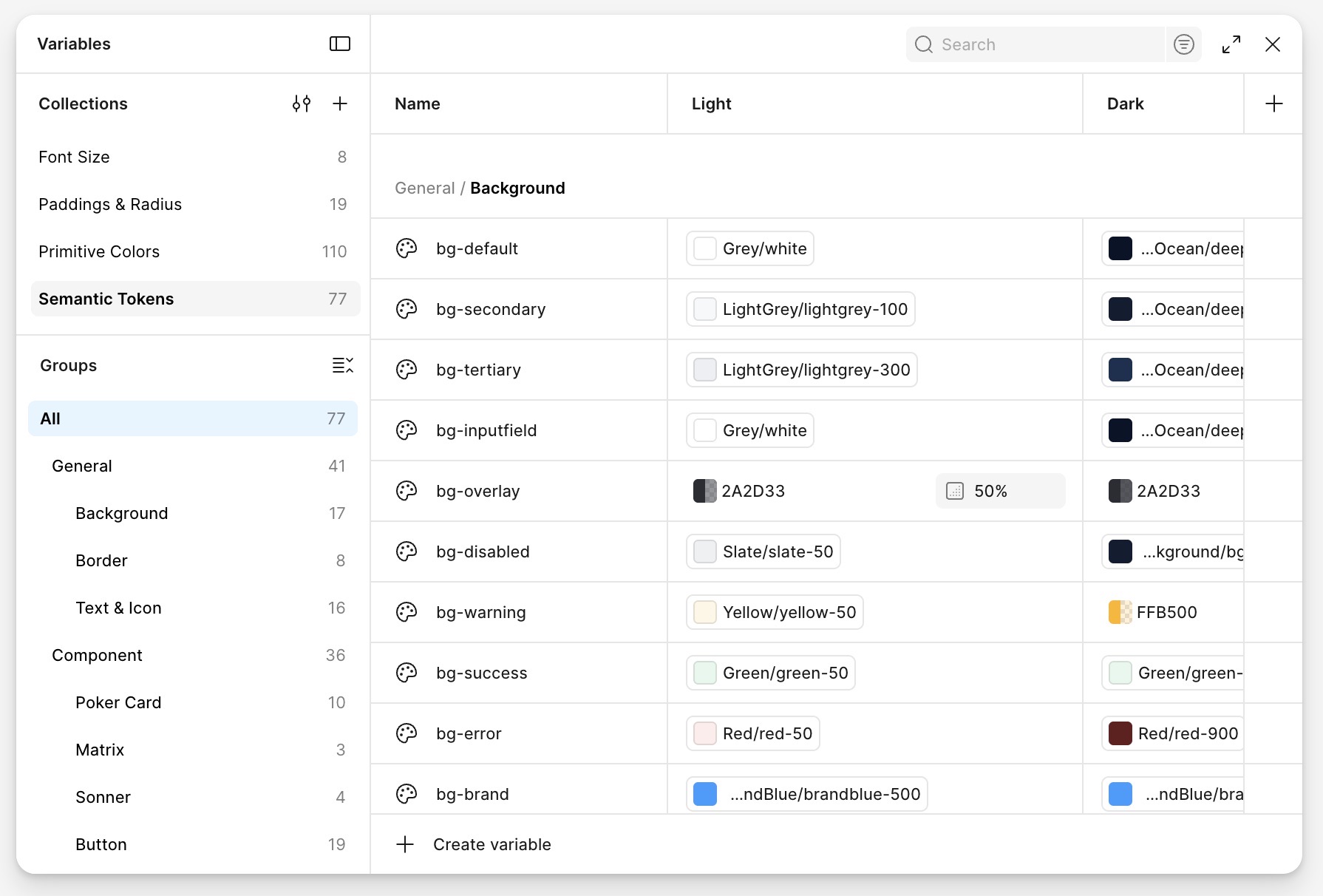
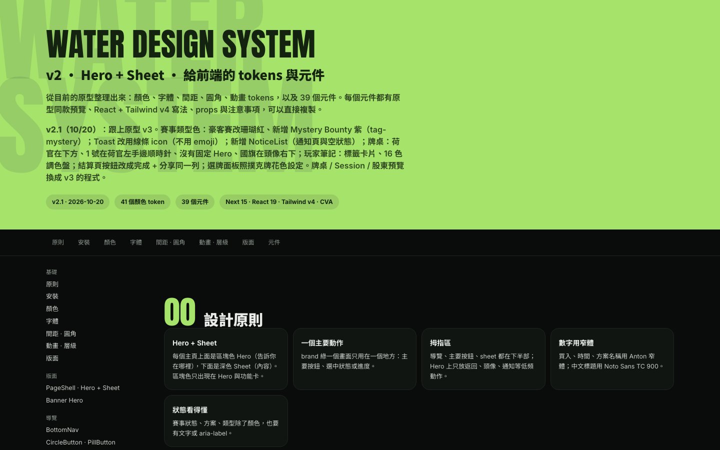
Tokens the code uses
Colour, type, spacing, radius, shadow and motion as Tailwind v4 theme tokens and plain CSS variables — plus a table mapping the old variables to the new ones, so the developer could migrate screen by screen.
Components with their code
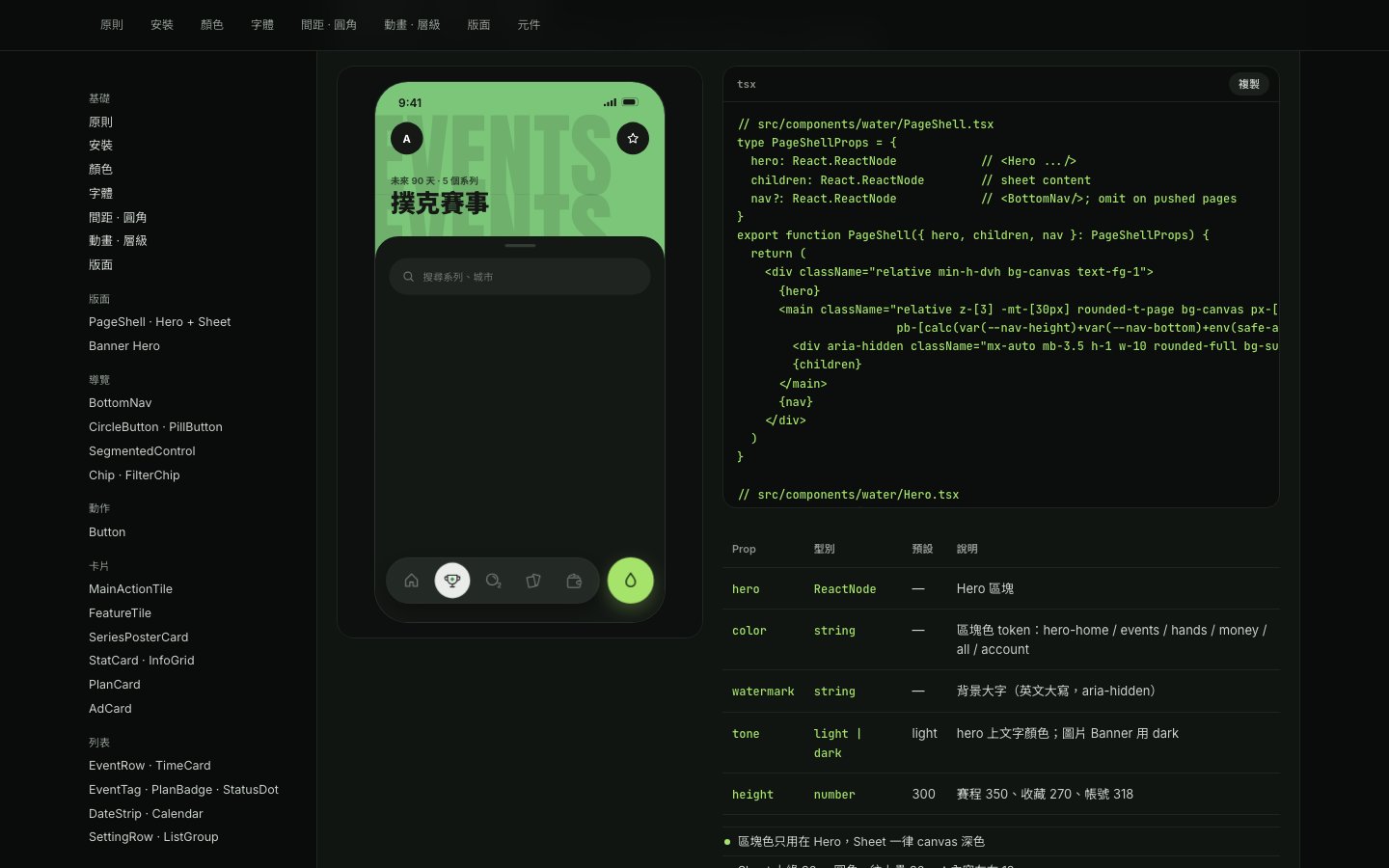
Each component has a live preview identical to the prototype, its React + Tailwind code, a props table and usage notes. Hand-off is a copy, not a measurement.
Principles you can check
Hero + Sheet on every main page · one brand-green primary action per screen · navigation and actions in the thumb zone · condensed numerals for amounts and times · status never shown by colour alone.
Iterating in the prototype
Iteration moved into code too. I describe a change to Claude Code, check the result on my phone and refine it until it's right — every version a clickable prototype instead of a set of frames.
Deliver easily
A prototype is a link, not a file to export. The PM and developer open the same version; the developer reads real layout, spacing and states.
Iterate quickly
A note from a review becomes a sentence, not a redrawn set of frames. Changes usually land in the prototype within 1–2 days, each with a changelog line.
Try out easily
Everyone tests the real flow on their own phone — real taps, sheets, empty states and errors — so feedback is about using it, not imagining it.
from a review note to a prototype the team could try, in Figma
from a review note to the updated prototype, now in code
The speed went into exploration. The homepage carries the most weight, so I explored it over six rounds before narrowing — from four dark-mode directions to a behaviour-led layout, then a deliberate range of styles, each tested on the same three screens.
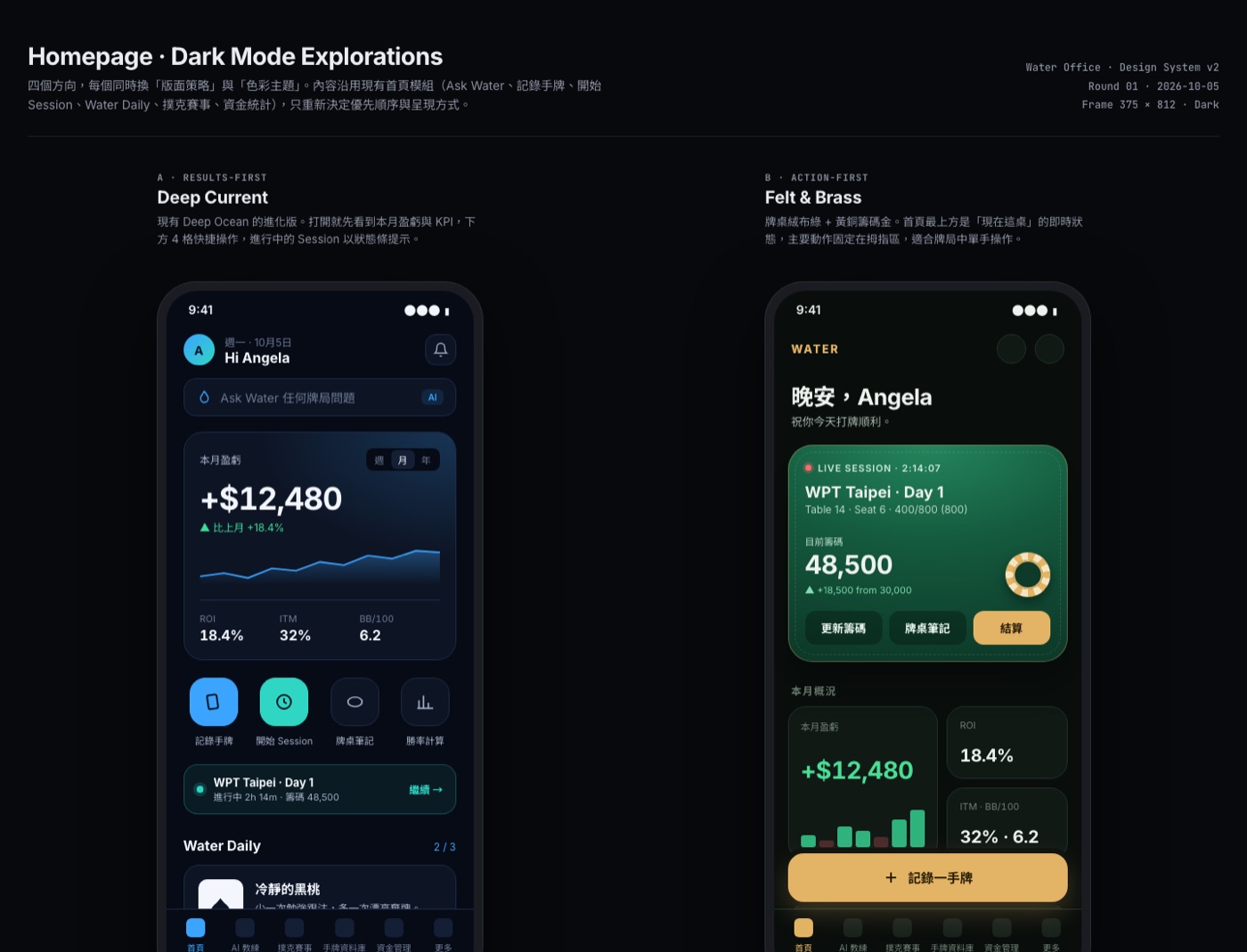
Rounds 01–02 · Directions
Seven directions, each pairing a layout strategy with a palette — from a results dashboard to an opponent carousel and a bento grid.
Round 03 · Behaviour first
I stepped back from style and mapped the contexts — at the table, off the table, brand new — into placement rules, then critiqued rounds 01–02 against them. This became the recommended direction.
Rounds 04–06 · Fidelity and style
High-fidelity variants, then nine styles across home, tournament list and tournament detail, and a deep dive on the one we chose.
The design decisions stay mine: I set the direction, the layout rules and the design system, and review every change. AI takes on the production.
Hero + Sheet: one layout language
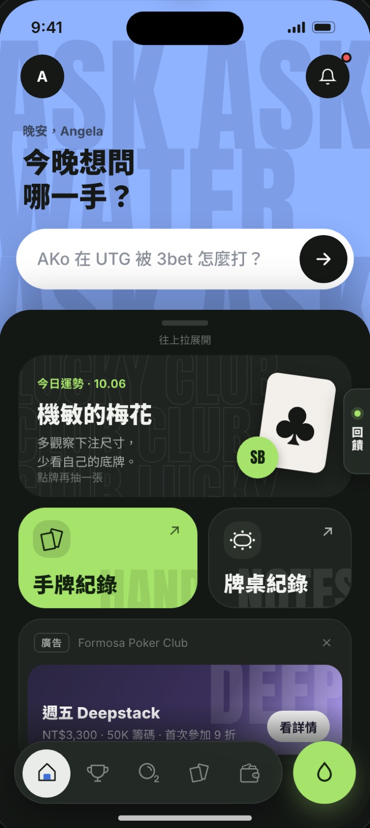
Every page is built from the same three layers, so people always know where to look:
Hero — what this page is
A full-bleed colour block with one giant word, at most 45% of the first screen. Each area keeps its own colour: blue for home and AI, green for events, coral for hands.
Sheet — the content
Lists and tools on a sheet that overlaps the hero and can be dragged up. Order: main action, then personal info, then lists.
Dock — the main action
Primary actions and navigation stay in the thumb zone. One lime primary button per page at most.
A clickable prototype of the whole app
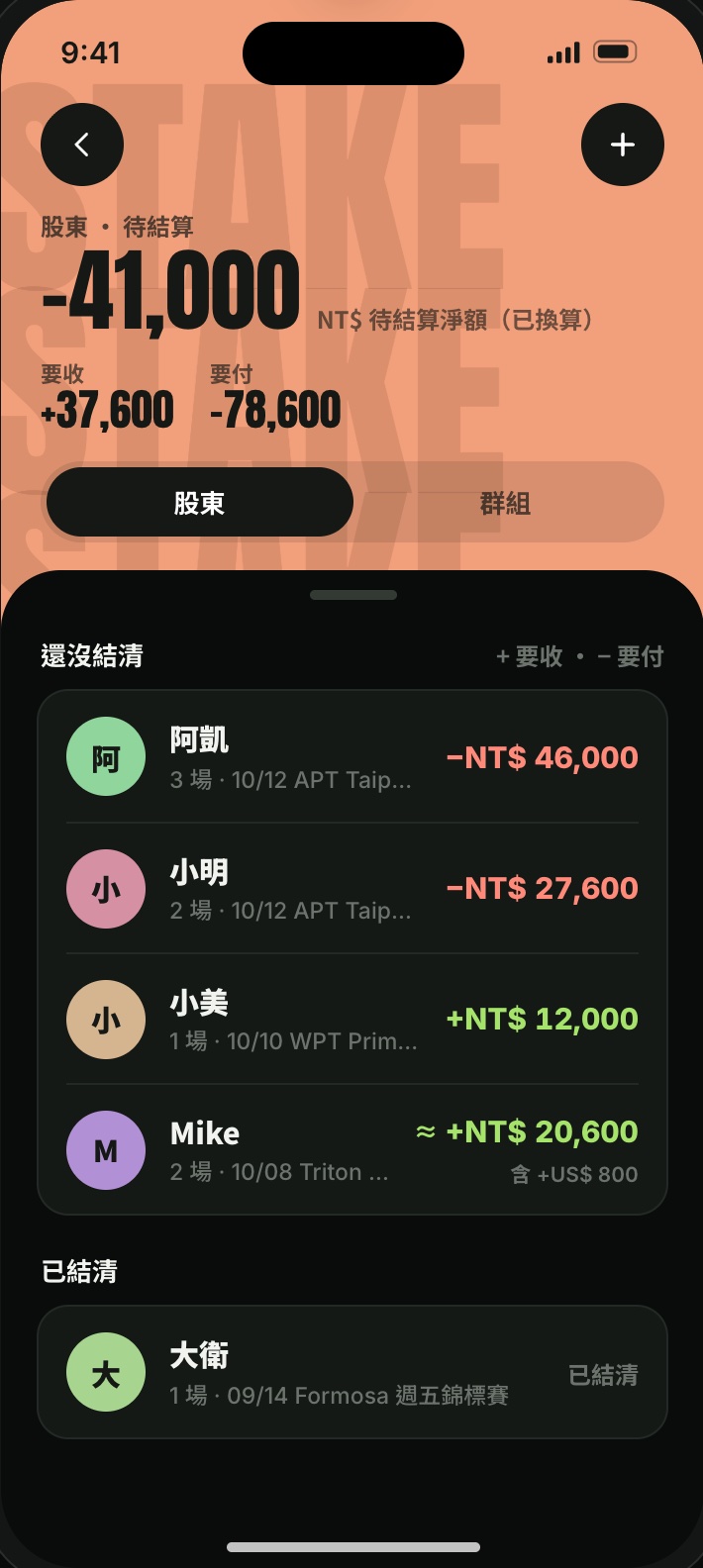
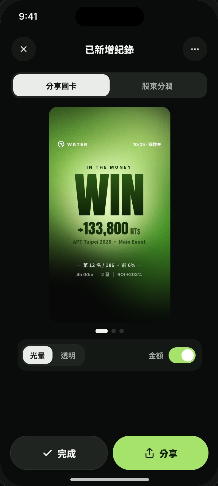
The result is one clickable prototype of the whole app, now on its third version, built from about 50 prototype files: a real navigation stack, sheets and micro-interactions.
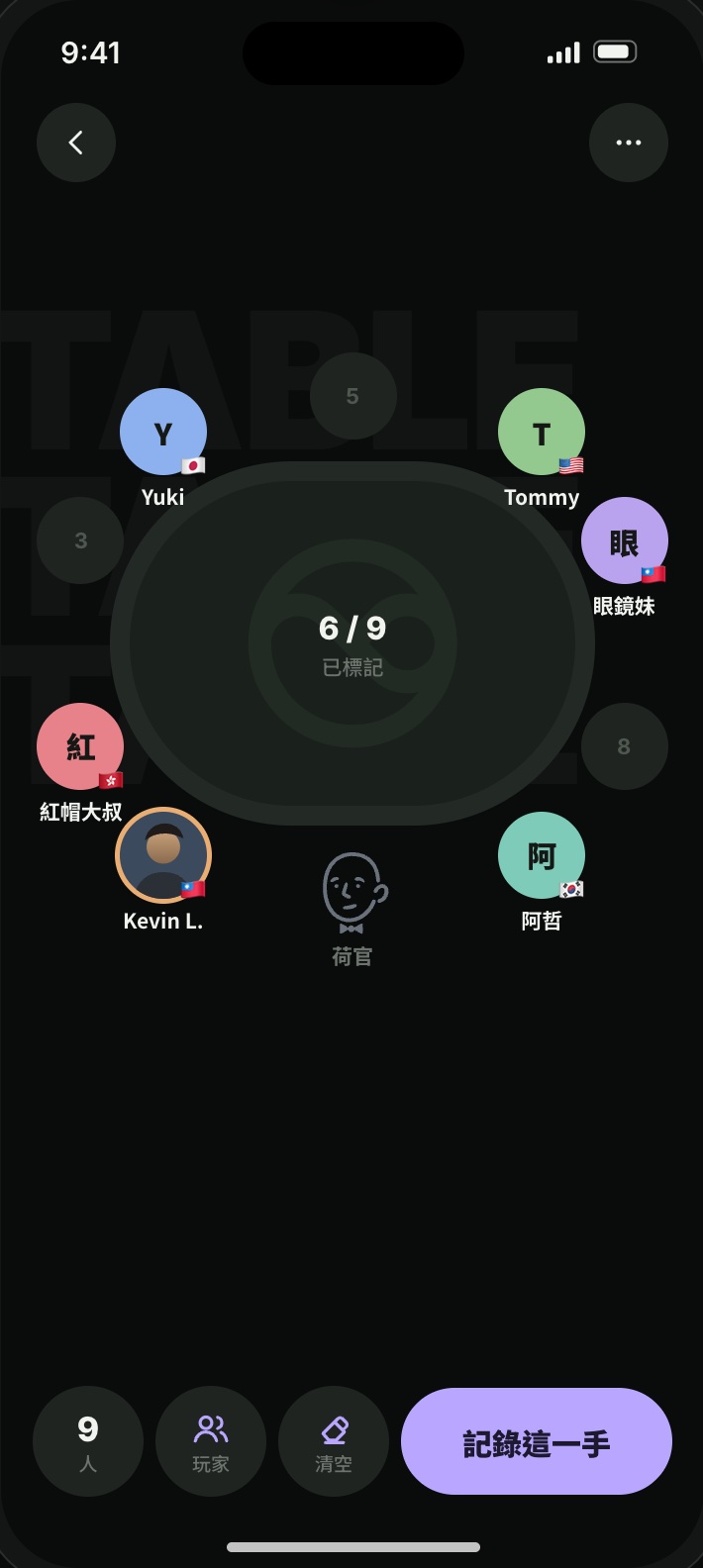
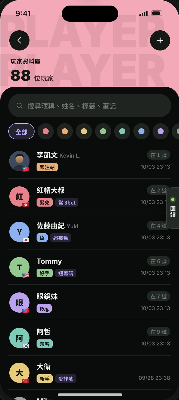
Flows you can walk through
Record a hand from setup to result, browse a tournament schedule, seat opponents at a table, settle a stake group, chat with the AI coach — including the empty, loading and error states.
Specs drawn from the prototype
For each function I wrote a spec: every screen and state, the rules (with worked examples for anything that calculates money), open PM questions with a design default, engineering notes and analytics events. Its screenshots are captured from the prototype in a headless browser, so the two never drift apart.
The Design Hub, for the frontend developer and PM
Faster iteration created a new problem: more versions, more questions. Prototypes lived on my laptop, PM questions were scattered across chats, decisions weren't written down, and the developer had no single place to see what was ready. So I designed and built a small internal tool for my two teammates — Next.js on Vercel, Supabase for data and sign-in — where they track work and answer questions.
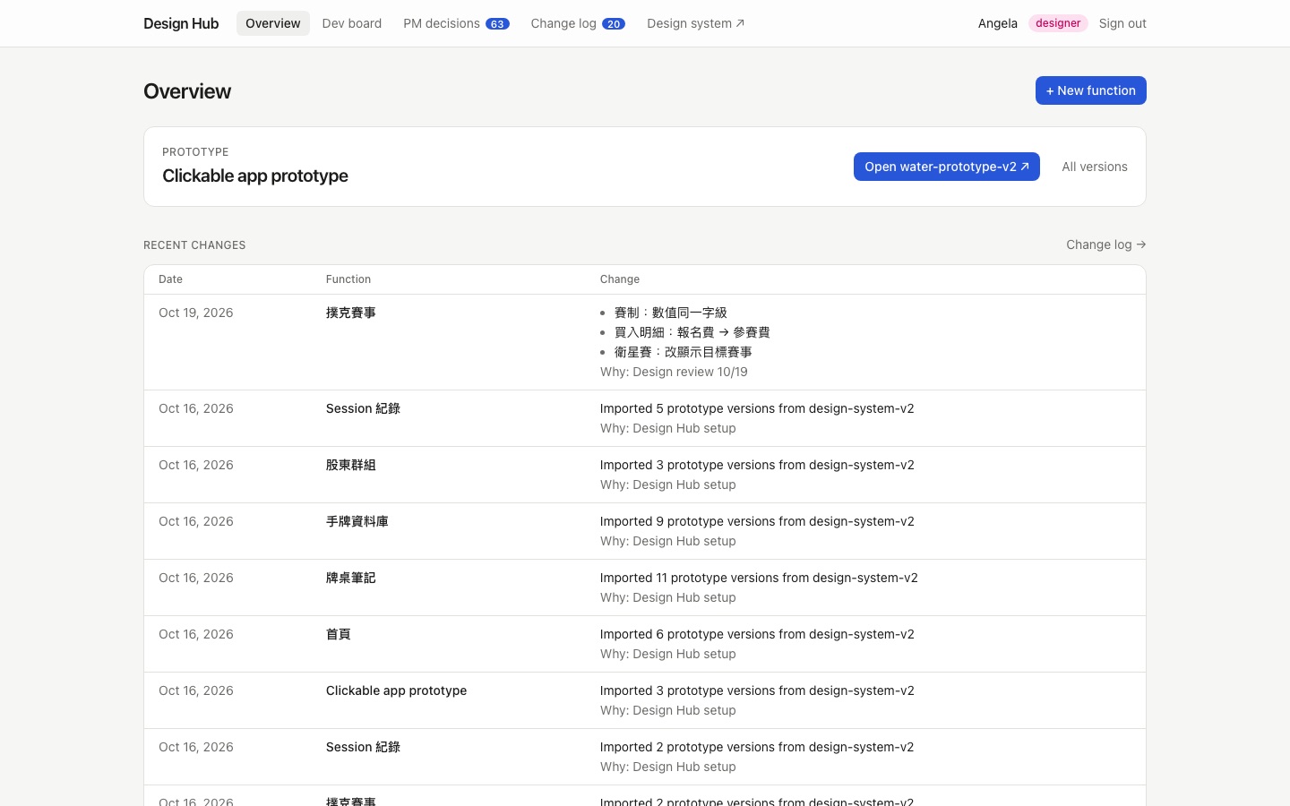
- (1)PrototypeNew version registered, with a changelog line for every change
- (2)PM questionOpen → discussing → decided
- (3)DecisionOne click from an answer, noting what must change
- (4)Dev taskPinned to a prototype version; flagged when a newer one exists
- (5)ShippedMoved across the board, linked to the commit
For the PM
Every open question in one list, filtered by function. Each comes with my design default, so the PM answers a proposal, not a blank page — and a decision is one click.
For the frontend developer
A board of tasks, each pinned to the prototype version it was designed in and flagged when the prototype moves on. A function can't be marked "ready for dev" while it still has open questions.
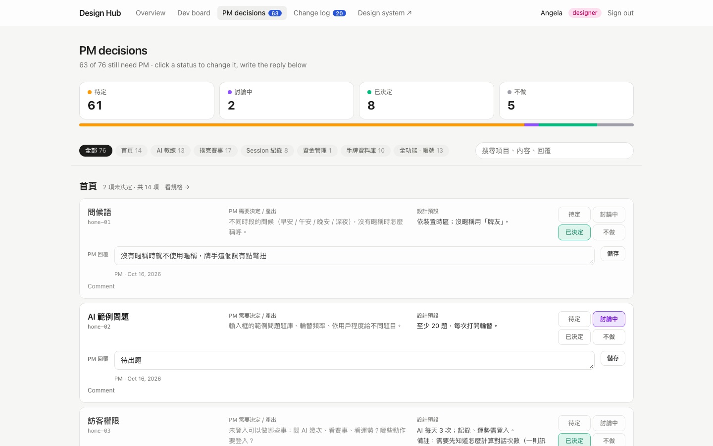
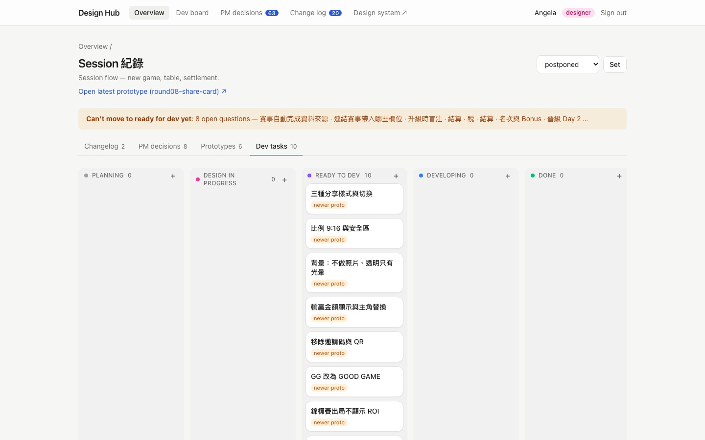
function specs, from homepage to share image
prototype versions moved into the hub at launch
PM questions moved into the hub at launch
Beyond the phone
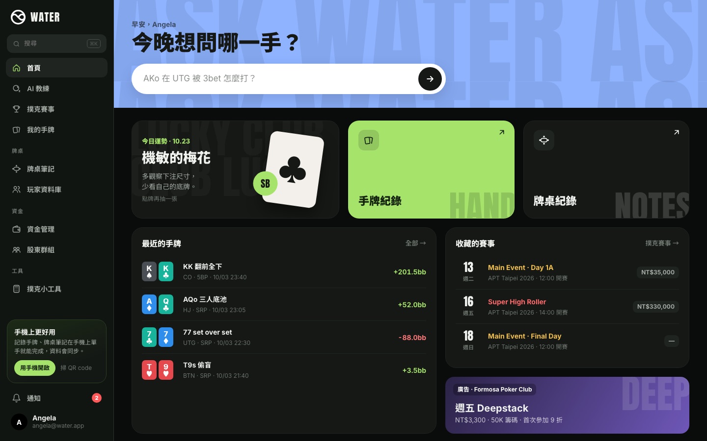
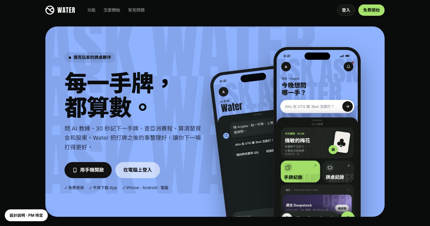
The same design system carries the desktop web version — for the work people do after a session, like reviewing hands and settling money — and the logged-out landing page.
Where it stands & what I learned
The redesign is in development and now in user acceptance testing. A review note now reaches the prototype in 1–2 days instead of 2–3 weeks. Hero + Sheet runs through the homepage, events, hands, table notes, bankroll and stake groups, on to login, desktop web and the landing page — and every PM decision and dev task lives in the Design Hub instead of a chat thread.
The design file is no longer the deliverable
What the team needs is something they can use and copy: a prototype to tap through and a design system written in their own code.
Speed is only useful with structure
Faster iteration produced more versions and questions than chat could hold. The Design Hub is what made the speed safe.
AI changes the craft, not the role
Claude Code produces; I still decide the direction, the rules and what's good enough — and the review is where the design happens.